Fluid layout
One of the most important things in User Interface is spacing and typography.
In Fluid UI those values changes relatively to viewport width without arbitrary breakpoints.
💡 Fluid means that...
we can get rid of classical breakpoints such as xs, sm, md, lg, xl, xxl, 3xl, ...
In our library we use CSS clamp() function to calculate all the values for different sizes scale: 50, 100, 200, 300, 400, 500, 600, 700, 800, 900, 1000.
Example:
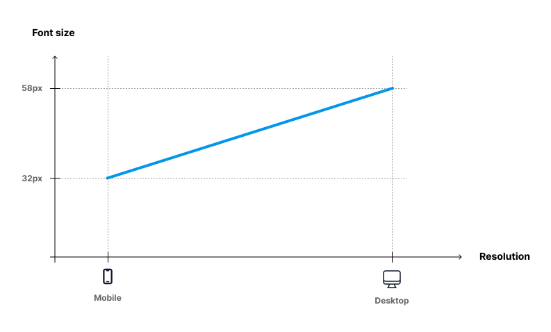
Let's define font size with a CSS variable:
SCSS
--g-fs-1000: #{g-fluid(32px, 58px)};--g-fs-1000: #{g-fluid(32px, 58px)};That means that this font size will scale linear from 32px (on mobile) to 58px (desktop).
The compiled CSS for --g-fs-1000 variable:
SCSS
--g-fs-1000: clamp(2rem, 2.65vw + 1.24rem, 3.63rem);--g-fs-1000: clamp(2rem, 2.65vw + 1.24rem, 3.63rem);And finally we define a class based on that value:
CSS
.fs-1000 {
    font-size: var(--g-fs-1000);
}
.fs-1000 {
font-size: var(--g-fs-1000);
}Better User Experience ...
- In final CSS we use rem values, however there are px values in the function call #{g-fluid(32px, 58px)}. It's easier to get the px values from the designs file (Figma etc.).
- User accessibility - there is rem value inside the clamp() to support browser zooming